Personal Investor Public Website: Redesigning the CX

Helping investors save their money with confidence and give them the best chance for investment success.


Problem Statement

How might we enable people to confidently step into investing with Vanguard by helping them make great decisions that improve their chances of investment success?

Organization
Vanguard Asset Management
Role
User Research, Interaction, Visual design, Prototyping & testing
Team
Me (Lead Product Designer) + Senior Product designer + PM + Engineering
Tools
Figma, Figjam, Adobe Experience Manager, UserTesting.com
Project Overview

Vanguard is the biggest investment company with 830,000 customers in the UK and 50 million worldwide.

The aim of the project is to build trust into investors by creating simple, engaging and world class customer experience. In 2022, Vanguard's B2C team decided to migrate the PI website from TeamSite to AEM CMS and to do that Vanguard's product team decided to form a public website team to improve the customer experience and bring it live. I led its overall UX, visual and interaction design.

Why a new Personal Investor public website?


Improved exprience
  • Uplift to the rebrand
  • Content strategy aligned to renewed value proposotion
  • Opportunity to address known client pain points (saying, doing & feeling)


Upgrading the systems
  • New Adobe AEM CMS which is easier to use
  • New monorepo architecture & component library
  • MarTech integrations


Increased enterprise reuse
  • Component development approach shared across all teams
  • Increased speed to market
  • Increased consistenct across and within business line sites

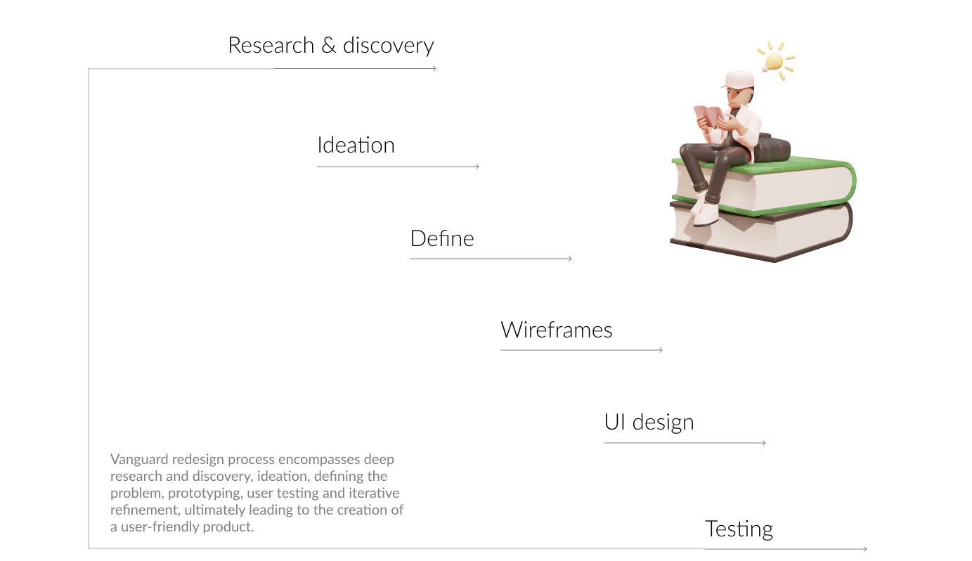
Design process


Research & discovery

1. DATA ANALYSIS

We started the research by seeing how our users currently navigate through the PI website is important to undertsand their needs and areas of interest and where they drop off. Overall after the homepage the product listings, ISA and SIPP are the most visited pages.
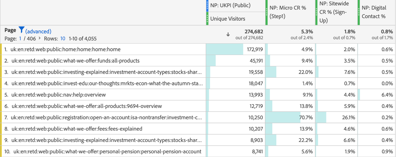
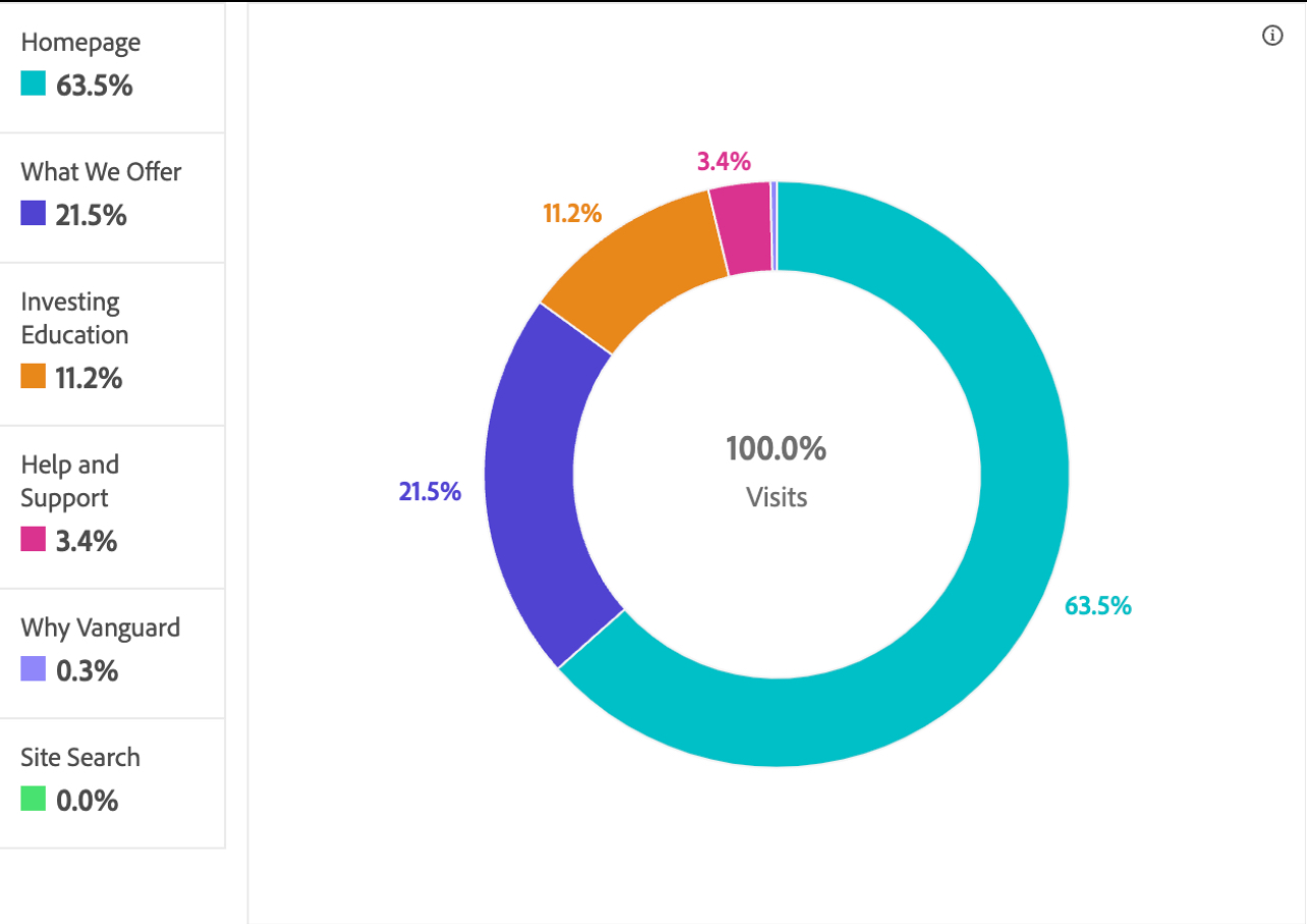
Fig: Pictures from Adobe Analytics to understand the number of visitors by page


2. QUALITATIVE INTERVIEWS

After looking at the data, I conducted interviews with 15 participants to explore the attitudes and behaviours of a wide range of users at different stages of their investment journey to gain insights into how we can better help serve prospective clients and users of Vanguard UKPI website.

Key research questions:
  • What initially triggers or motivates users to select a platform for their investments?
  • What are the expectations/needs of users when considering investments?
  • What research process(es) do users go through when considering investment platforms?
  • What are essential considerations users regard when selecting an investment provider?
  • How do we fare compared to competitors in the industry?
  • Are there any barriers or pain points users encounter when commiting to a provider?


  • 3. COMPETITIVE ANALYSIS

    With everything I do I always look at what others are doing in the same or similar spaces - the good and the bad. To strengthen our ideas, I looked at several competitors. I created an excel sheet that reflected several themes comparing different competitors' home page and product pages.
    Overall I noticed the following four trends:
    1. Financial independence and freedom are common themes
    2. Simple, ease of use and automated options featured
    3. Primary next best option is to open an account
    4. All have some form of educational content


    4. USABILITY TESTING
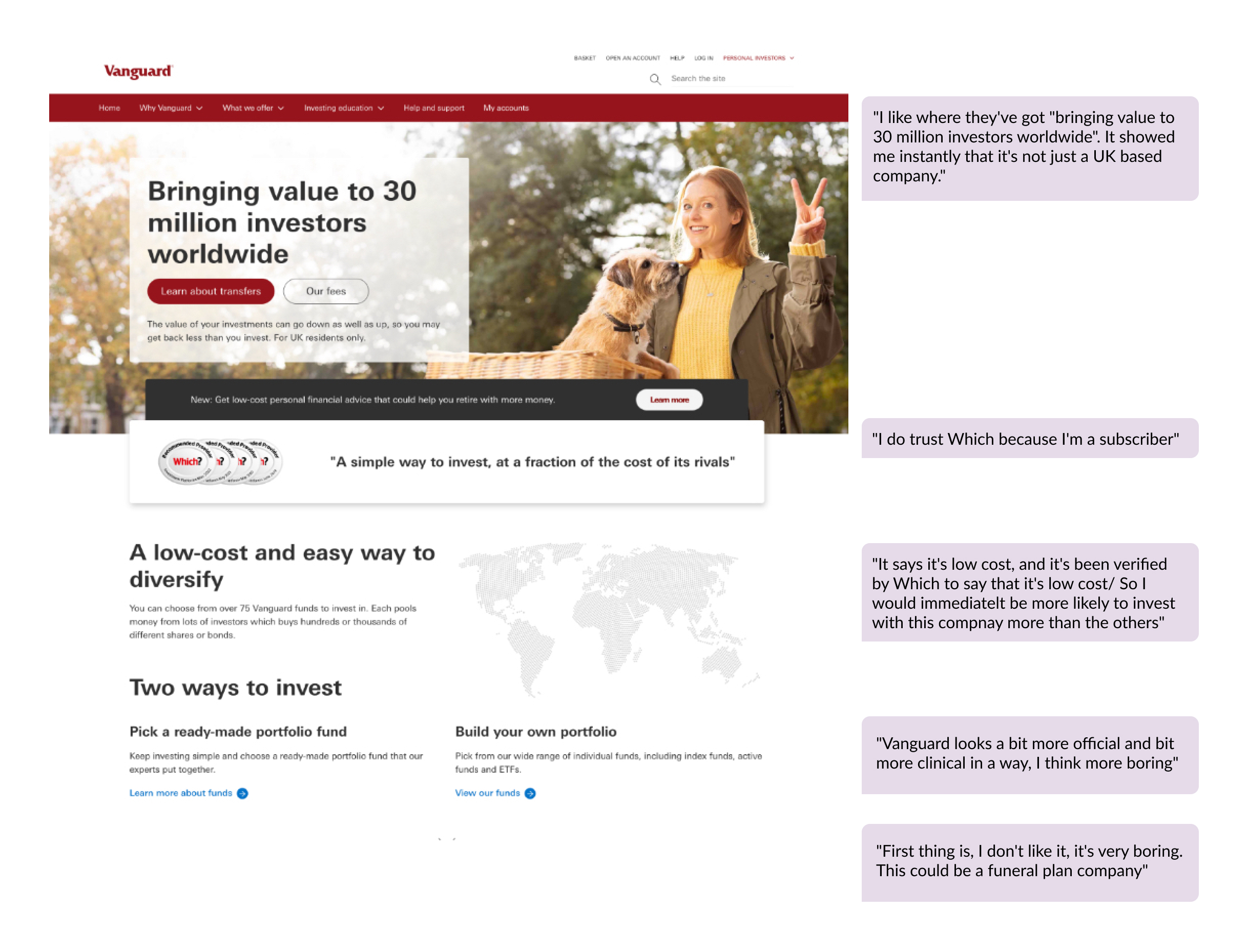
    We tested Vanguard's homepage, ISA and SIPP pages to undertsand what the three most important pages were lacking of.


    Fig: Homepage of Vanguard UKPI website - 2023


    5. PAIN POINTS FROM CLIENT SERVICE TEAM
    We met with client service team to gather pain points of clients so we don't miss what problems our existing and new customers face on daily basis.

    Fig: In-depth session with client service team members


    6. FINDINGS

    Build trust

    • Trust does not come from one source. Being perceived as trustworthy requires a multi-angle approach across reputation, assurance, safeguarding and communication.
    • Satisfying a user's need for trust is the single biggest gain available in convincing prospective clients to join.

    Empower and educate

    • We need to keep challenging our participants' perceptions of who counts as an investor and who can become one.
    • Demystifying the idea that investing is complex and needs large sums would welcome far more prospects in.

    Service excellence as standard

    • Participants told us how much it matters that companies are proactive in their communications and easy to reach, whatever the channel.
    • Once someone is in touch, the service has to be expert enough to build the relationship rather than just close the query.

    Minimise client effort

    • Participants of every age embrace technology, and biometric authentication is now established and used confidently.
    • An excellent digital experience across devices is simply expected, and is close to being a deal-breaker where it is missing.


    Ideation

    First, we articulated a few design goals that acted as guiding principles for this project. Our design should ...

    Existing customers

    • Easy transition to the new site
    • Achieving their investment goals
    • Refining their understanding
    • Knowing the impact of current events on their investments

    New customers

    • General investment education
    • Can intuitively navigate the site
    • Can get the information they need
    • Understand Vanguard's USPs
    • Transparency with fees

    Here's some process work from a ~pretty~ intensive brainstorming session.
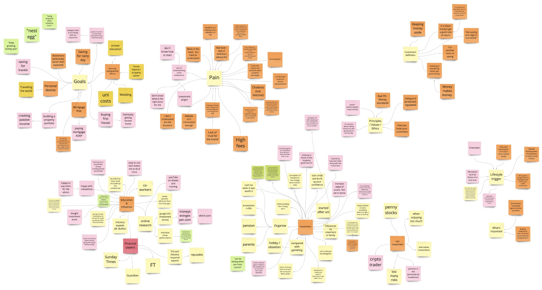

    Fig: 100 ideas, literally

    Define

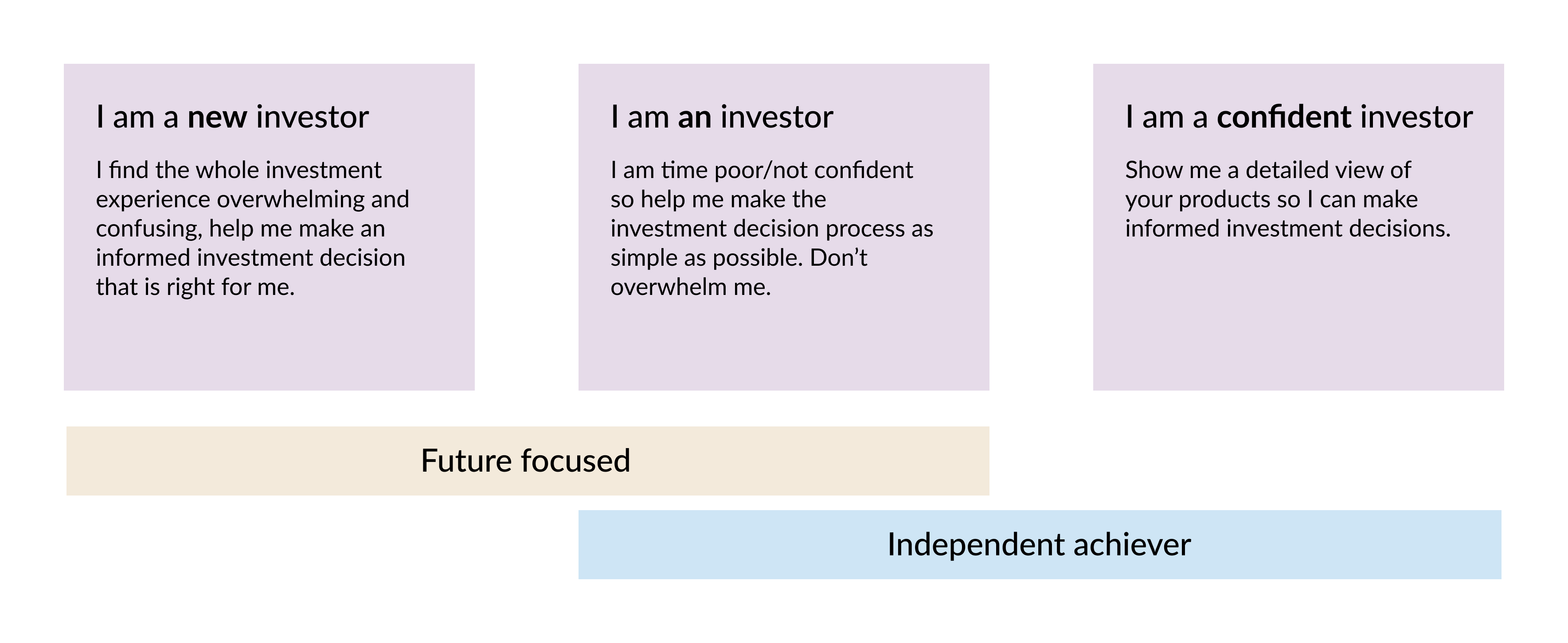
    There is no 'one size' fits all. While we address less confident and more confident investor needs there is a missing middle investor and that is the investor who may have been investing for a long period of time but not deem themselves as confident or they may be simple time poor.
    Fig: Vanguard personas


    Laying the Groundwork

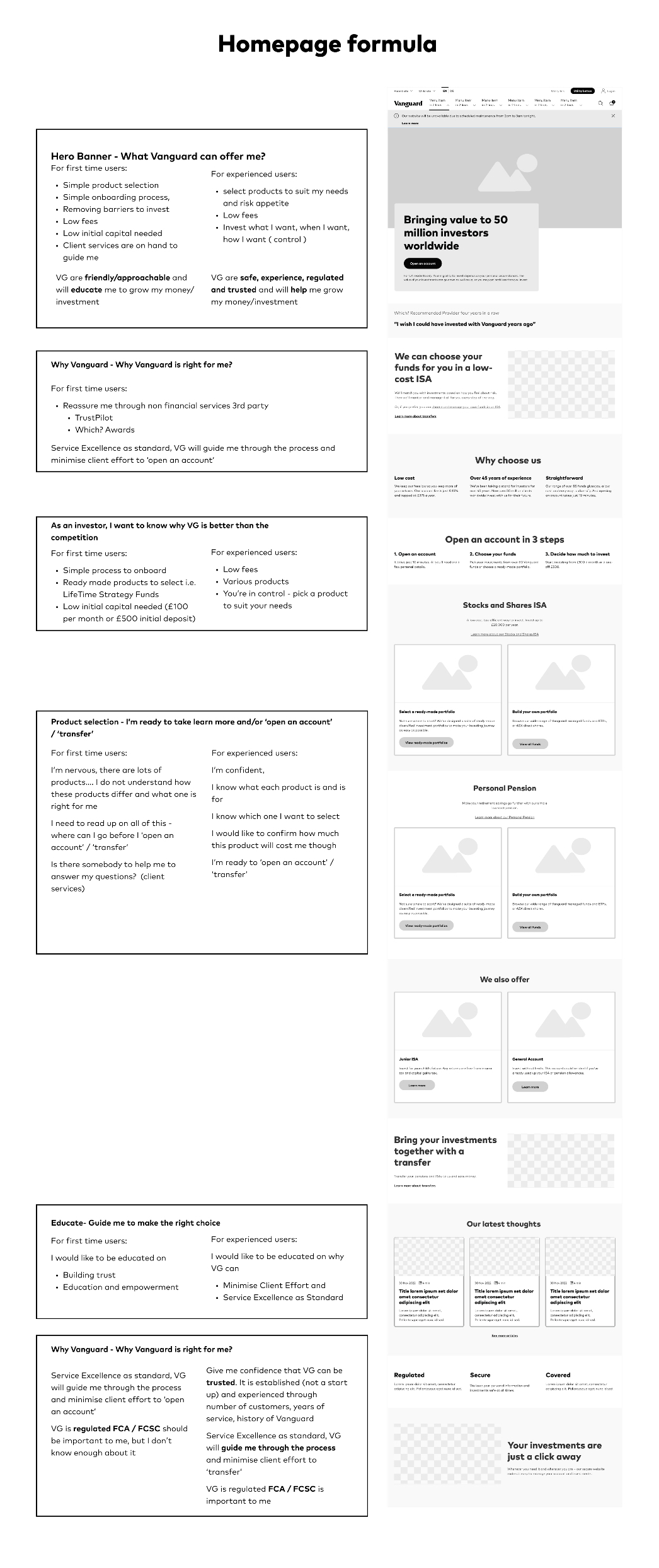
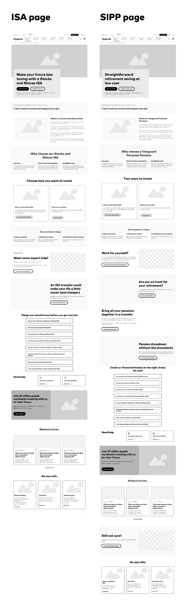
    As Vanguard is a large company with over 600,000 customers, we didn't want to take a risk to change the look and feel of the whole website overnight. Hence, the product and marketing teams decided to only work on the high traffic and high conversion pages to begin with which were homepage, ISA and SIPP pages. After such a deep research and defining design goals, content designers and product designers created low-fi wireframes of homepage, ISA and Sipp pages.


    Fig: Lo-fi wireframes

    Visual Direction

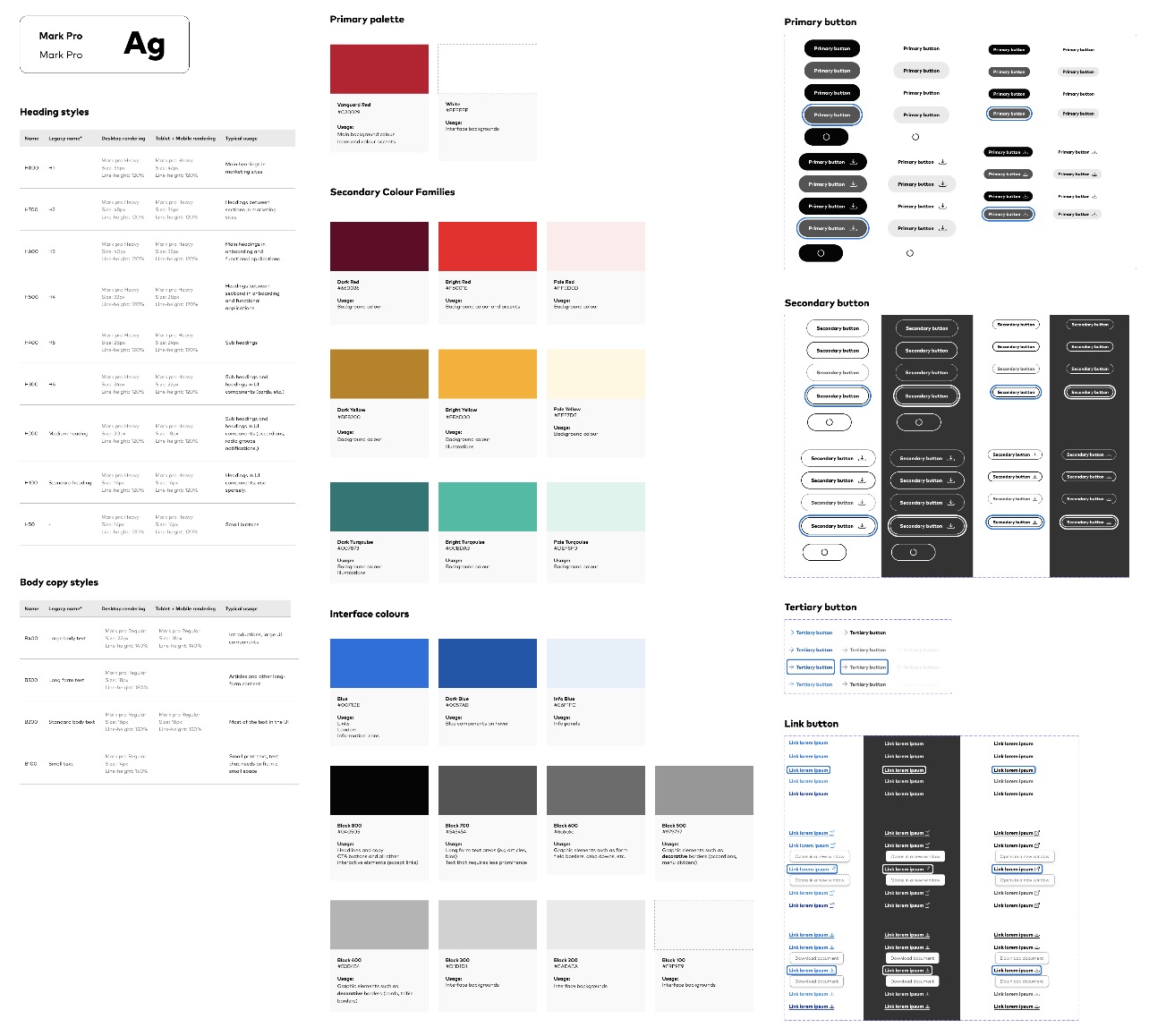
    I created a UI Kit and implemented a design system to instil consistency in our high-fidelity designs.


    Fig: Design system at glance


    What Worked and What Didn't

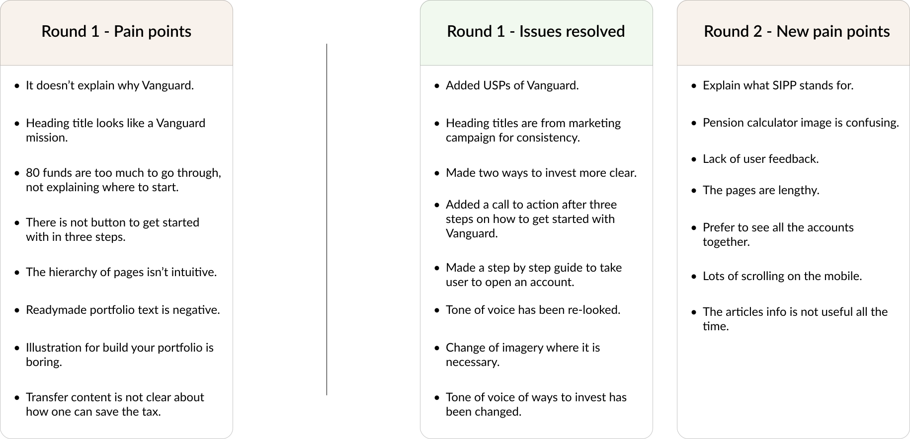
    We conducted two rounds of user tests and wanted to not only test the functionality of our pages but also if it served its intended purpose. Although issues in the first round of testing was resolved, we noticed new pain points emerging.


    We used the MoSCoW framework to prioritize which suggestions to implement.
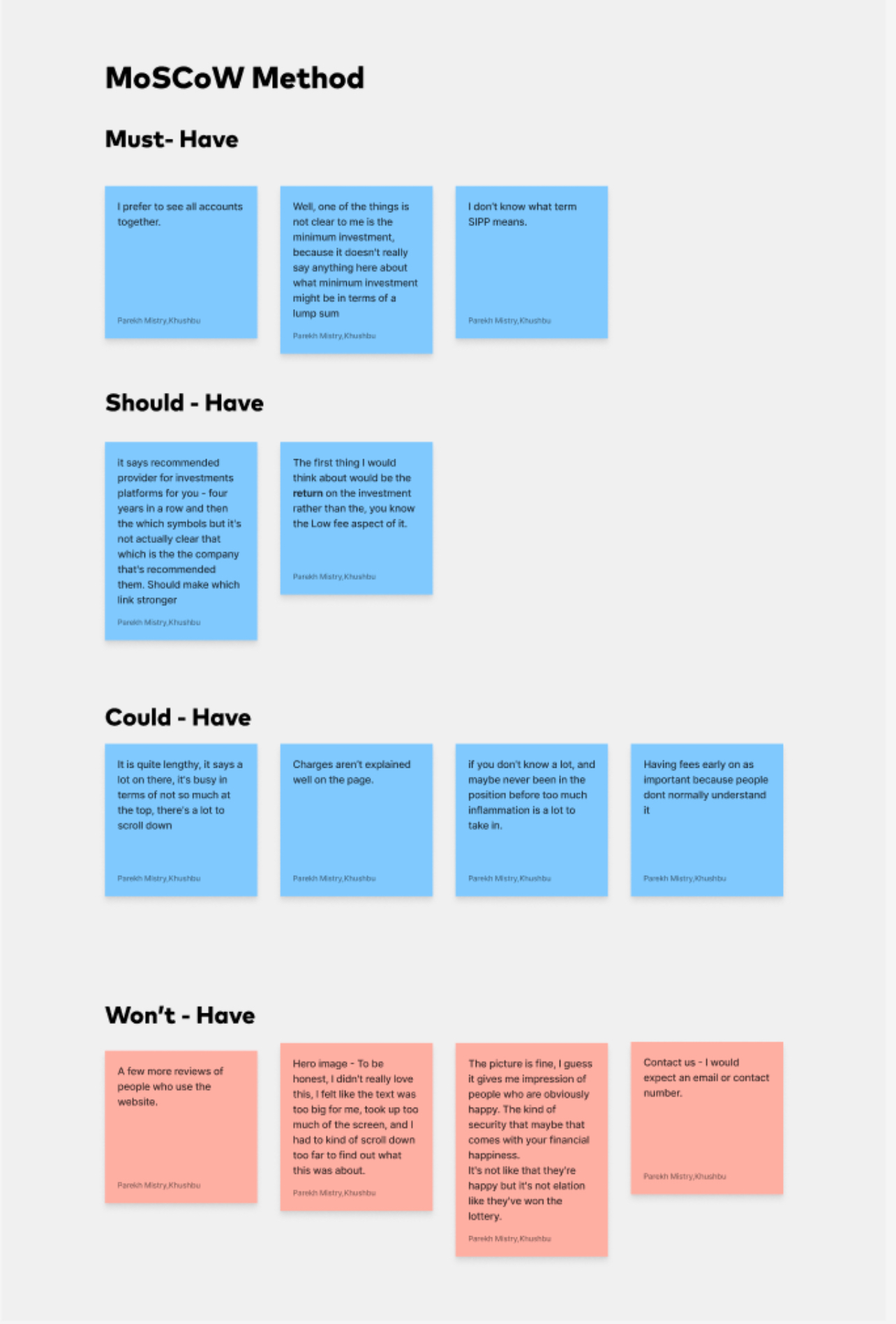

    Fig: MoSCoW method

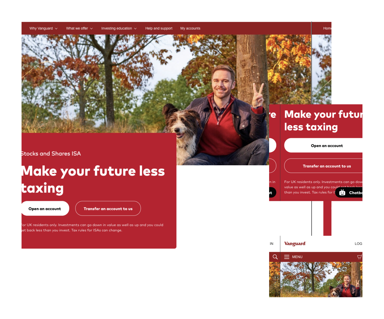
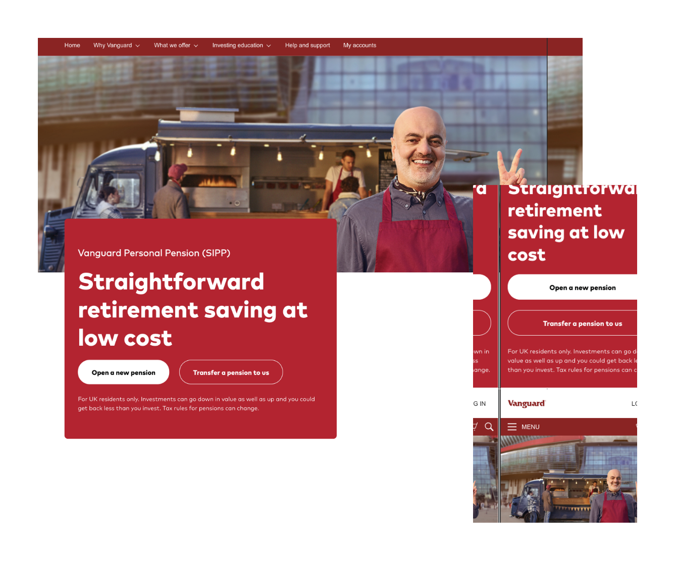
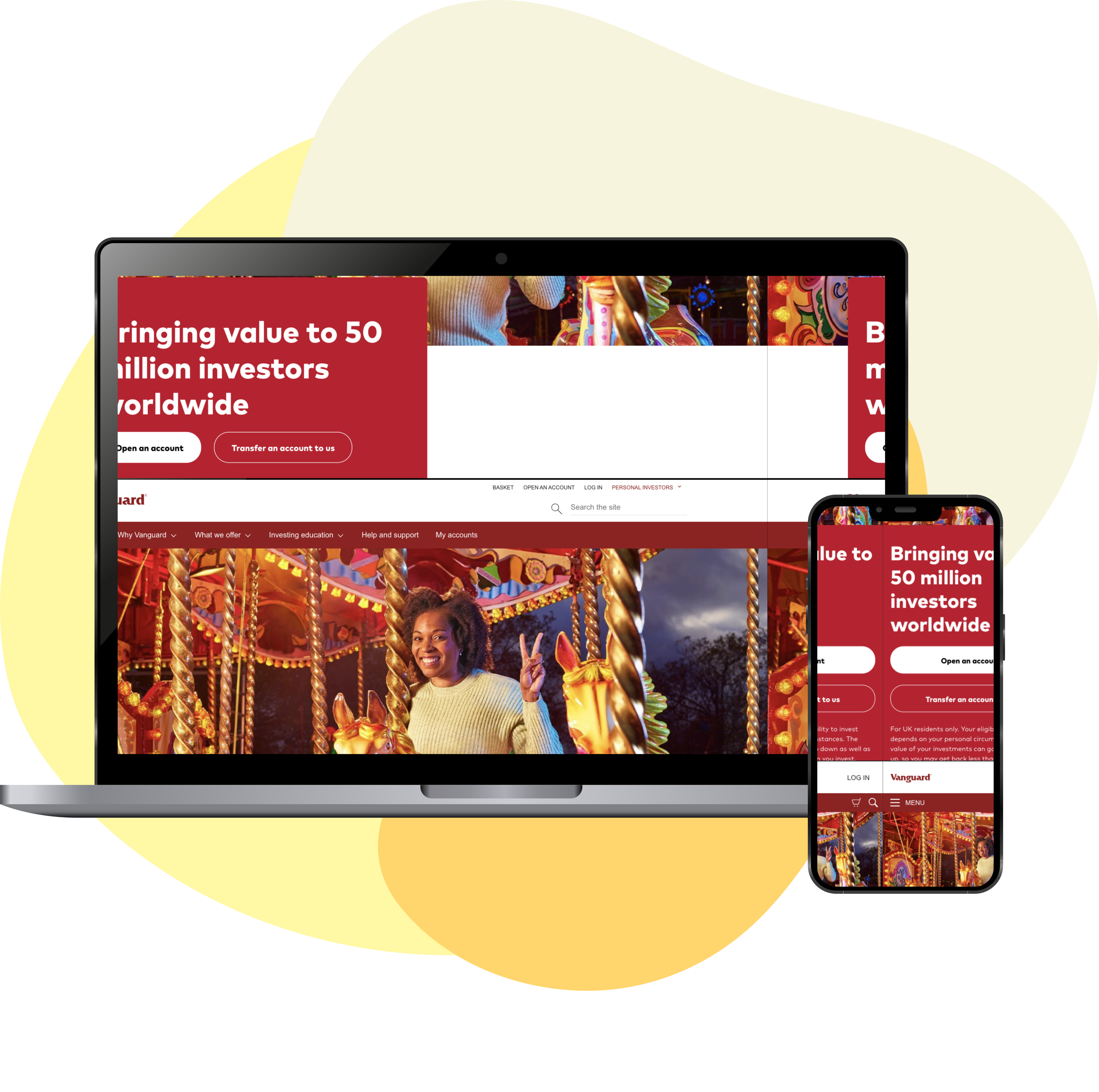
    Introducing new homepage, ISA and SIPP pages
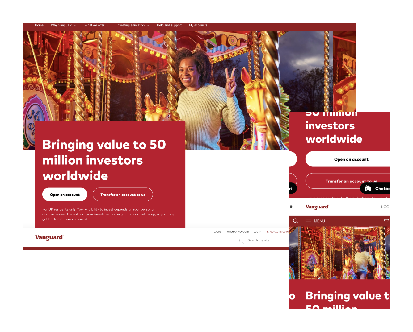
    HOMEPAGE

    A Friendly Experience

    • Open an account and transfer call to actions upfront
    • Hierarchy of the page tells a story on what is Vanguard, why they offer and how to invest
    • Educational articles to make beginner's life easier

    ISA PAGE

    Invest with confidence

    • Easy and user friendly description of what is Stocks and Shares ISA is
    • Clear segregation of two ways Vanguard offers to invest
    • Explanation of fees in detail
    • FAQs from client service teams to easily get answers to common questions

    SIPP PAGE

    Get retirement ready

    • Easy and user friendly description of what is Personal Pension is
    • Clear seggragation of two ways Vanguard offers to invest
    • A dedicated section for self-employed people
    • Clear withdrawal information on retirement
    • Clear tax benefits of SIPP

    Results

    We released the new designs in January and have been pulling in data since, using it to make more informed design decisions.

    Homepage

    +38%
    Pre-launch3.9%
    Post-launch5.4%

    ISA page

    +96%
    Pre-launch8.1%
    Post-launch16%

    SIPP page

    +72%
    Pre-launch15%
    Post-launch25%
    What I learned

    Although I had my vision for the design, I had to learn to communicate that clearly with my team members while making sure it delivered the content intuitively and stayed accessible. I realized that compromising takes time and is a necessary step that helps the group become more productive in the long run.

    As a designer, instead of luring by attractive, trendy and out of the box designs, the primary goal is to understand the user, their problems and then come up with a design that solves it. Creating a strategic plan to launch an MVP helps deal with out-of-scope requests that could potentially derail the project and helps deliver a quality product in time. Keeping the stakeholders/users in loop and testing solutions in whatever form (paper, low-fi or hi-fi) as early as possible saves ample amount of time and re-work

    I learned to challenge senior people on what I firmly believe was right and it worked out so well. I got experience leading the team and delivering the right product.

    Although this project took lots of learning and problem solving, I'm proud of our final product and happy to have made a few new friends!